In 2022, due to the departure of foreign businesses, many brands in Russia changed their names. McDonald’s has become Delicious and that’s it, replacing the usual red and yellow palette with green and orange. Starbucks is in Stars Coffee, and instead of a mermaid, a girl in a kokoshnik appeared on the logo.
On a fashionable wave, the Wildberries marketplace was transformed into Berries — however, only for a day and as part of a marketing campaign.
All these events partly discredited the concept of «rebranding» in the eyes of investors. And in vain, because quite often a change in the name of a company and a change in style make a business stronger and improve its financial performance.
«Number»
In October 2022, the international holding Freedom Holding Corp. announced a major rebranding. — the company’s management decided to leave the Russian market by selling local assets. The deal included an investment company and the Freedom Finance bank, which received new names — Tsifra Broker and Tsifra Bank.
The word «digit» is a reference to digitalization, the main trend in the financial market in recent years. Through the new name, the company denotes the future trajectory of business development — the large-scale transformation of Tsifra into a digital ecosystem that will unite an investment company, a bank, a management and leasing company. Cifra believes, based on successful cases in Russia and abroad, that the new name will help create the right associations for investors and clients and give impetus to business development.
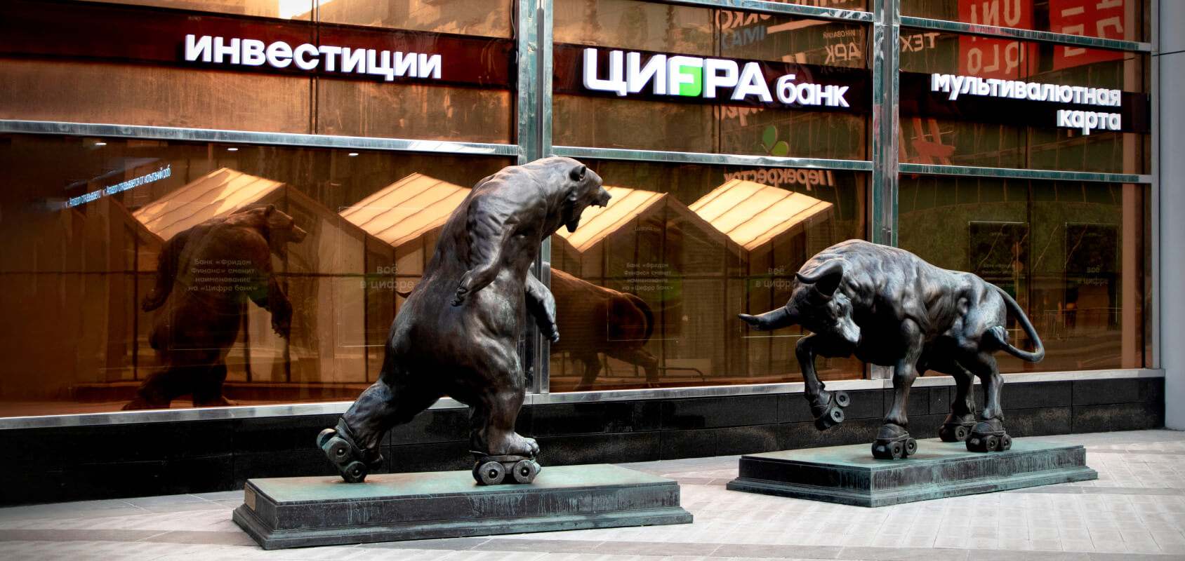
The choice in favor of the Cyrillic alphabet is also not accidental — this is a sign that the company is working with the Russian market. The new logo is made in the company’s traditional colors — black and green — to convey the idea of continuity with the values and level of service of Freedom Finance.
block
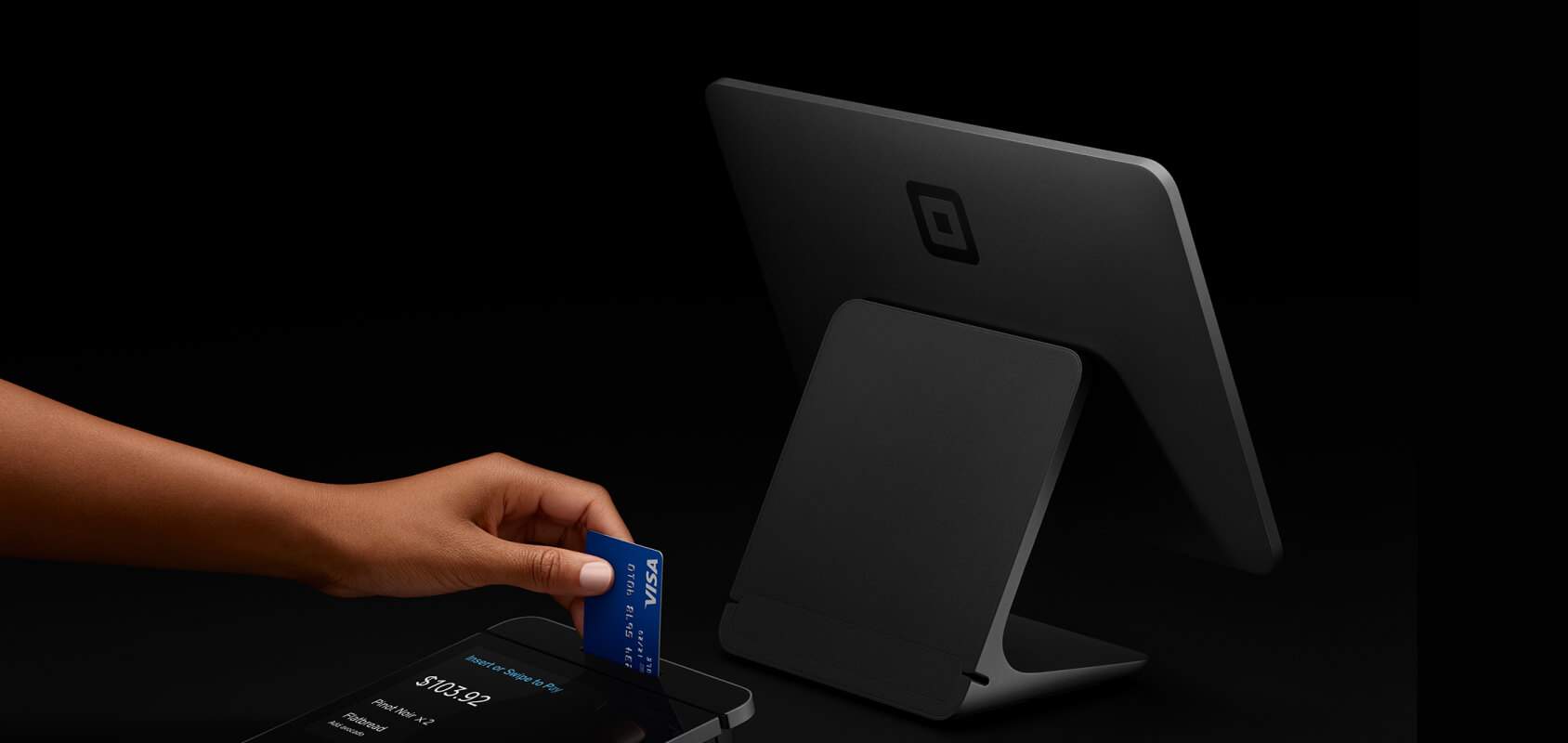
One of the most spectacular transformations of recent years is the rebranding of the second big brainchild of Twitter founder Jack Dorsey, financial company Square. In 2021, just days after Dorsey stepped down as head of Twitter, the firm changed its name to Block.
Square, since its founding in 2009, has been accepting and processing payments from small and medium-sized businesses, which is what its name has been associated with for many years. During this time, the business has grown: the ecosystem eventually included the Cash App money transfer service, the Tidal music streaming service, and the Square Crypto bitcoin promotion project.
To reflect these changes, the name Block appeared — it was supposed to show that this is a modern business, closely related to cryptocurrencies and blockchain projects. In addition, the name referred to residential quarters of block houses, obstacles to be overcome. In general, a whole set of useful associations.
High-quality rebranding should be supported by changes within the company, its transformation and new goal setting. In this case, visual and verbal communication reinforce all changes and the update becomes more organic.
So was the rebranding of Square. The company is transforming and updating not only at the graphic level. It is worth noting that the Square brand does not go away at all, it becomes more consumer, and the role of the parent brand is occupied by Block.
Bold solutions require non-standard approaches, but this is the only way such solutions can appear on the market and pull up the rest of the players from this category. Name Block is quite capacious and daring. In addition to positive connotations, this word has quite negative connotations, but the company was not afraid to use it. In general, a non-standard and visionary approach can be traced, which is largely due to the personality of the founder Jack Dorsey.
As for the corporate identity, the complex combination of a dynamic cube shape with a metallic holographic surface and plastic twisting creates a technological and innovative image. By the way, despite the fact that Square was rebranded in-house, and with strong design teams such an approach is possible, design agency 1.0 was still involved in the development.
Lloyds Bank
Lloyds Bank TSB is one of the four largest banks in the UK in the past. In 2013, Lloyds was forced to split from TSB to pay off the bailout the EU provided to the bank during the 2008 crisis.
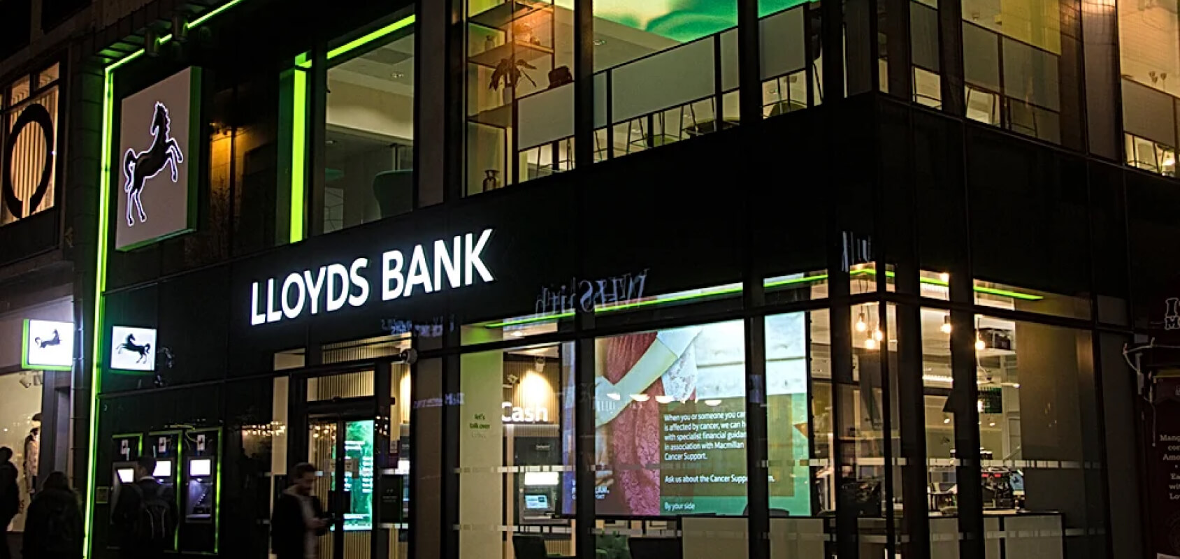
After the TSB spinoff, Lloyds updated the visual and its positioning. The bank announced a greater focus on the client — this is reflected, for example, in a new, more friendly and calm color scheme (green has become the main brand color). And also in new advertising slogans. According to Lloyds Bank’s director of brand and marketing, Katherine Kehoe, the bank’s team relied on «the moments that really matter in life, whether it’s helping our clients buy their first home or helping grow their business.»
In total, about 1,300 branches of Lloyds Bank participated in the rebranding. According to Rufus Leonard, the agency that developed the new visual identity, the rebranding was received positively and helped boost the bank’s turnover by £1bn.
S7 Airlines
Acid green is a fashionable color even by modern standards. That is why it is even more surprising that S7 Airlines planes were painted in this color not a year or two ago, but back in 2006.
The transformation of Siberia Airlines into S7 Airlines was a landmark event for the industry. To take at least a name — the world-famous marketing guru Jack Trout opposed him. He assured the company’s management that with the name S7 Airlines they would not become a federal-scale carrier. But now it is obvious that he was mistaken.
The new S7 Airlines brand has become a breath of fresh air for passengers: modern lounges, buying tickets via the Internet, pilots who cheer with jokes over the speakerphone. All this helped in the first half of the year since the start of active rebranding, not only to increase the occupancy rate of S7 Airlines aircraft by 1.6 percentage points, to 73.3%, but also to quickly correct the company’s significantly worsened reputation, which was negatively affected by several high-profile air crashes.
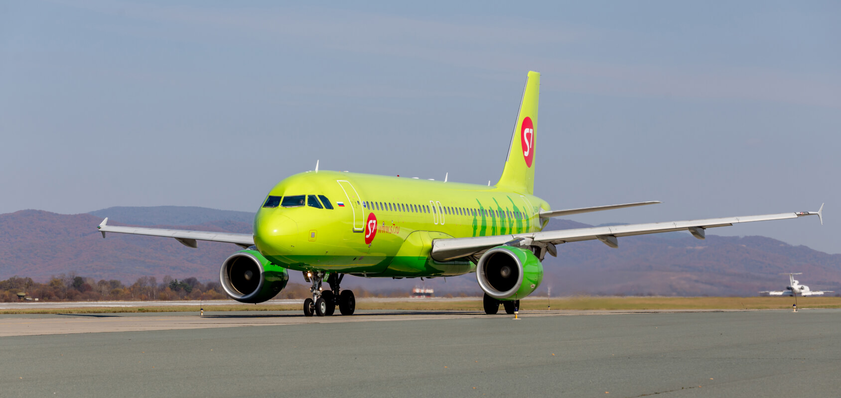
Perhaps one of the most striking and high-quality examples of rebranding on the Russian market. The management of «Siberia» pushed for renewal the expansion of business to international markets, as well as the desire to take market share from the main competitor due to the new image.
The company managed to really upgrade and reach a new level: platform, name, positioning and corporate identity — everything was done with high quality and was far ahead of its time. The rebranding of the company affected absolutely all points of contact with the consumer, from the first site in Russia with online ticket sales to the complete repainting of airliners. Many noted that S7 Airlines aircraft stand out against the background of other aircraft, clouds and snow. Thanks to the update, it was possible to create the image of a modern and progressive air carrier, as well as to neutralize the negative trail from the past.
As a result, this was also reflected in business indicators, which showed excellent growth dynamics in the first year.
In 2019, the story about changing the name of the carrier was continued. In the summer of that year, significant forest fires engulfed the Siberian forests. S7 reminded everyone that their homeland is Novosibirsk, and Siberia is a great value for every employee. Therefore, the company’s marketing launched an advertising communication with the slogan «We are Siberia», within the framework of which the name on the sides of the airliners was changed and a fundraising was organized to plant a million trees. This activity showed how skillfully you can operate with your story, and also brought colleagues the international Epica Awards.
Voya
In 2013, the American division of the Dutch bank ING spun off from the parent company. The new company took the name Voya — from the word voyage. The name was supposed to reflect the new mission and values - a focus on helping clients on their path to a stable financial future.
“The name Voya reminds us that a secure financial future is more than just achieving a goal. Preparing for it should be like a journey and a positive experience along the way,” explained Ann Glover, director of marketing for the company. To convey optimism and future orientation, the updated design used, for example, orange, a bright, dynamic color that is associated with movement.
According to Paul Gennaro, vice president of brand and corporate communications at Voya, the rebranding was successful and increased brand awareness. This is evidenced, for example, by the results of an advertising campaign on LinkedIn — there the number of Voya subscribers has doubled. In addition, Voya successfully went public in 2014 and raised $1.27 billion.
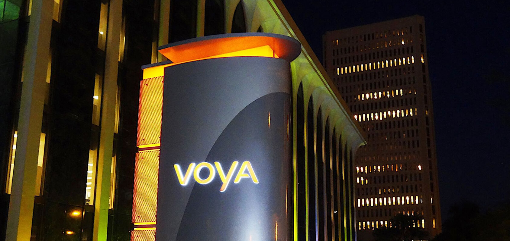
The Voya case is a very good example of how one strong identity evolves into another strong identity. The key word here is evolving. Because for all the seeming radicalness of the rebranding, the new brand retained exactly as much continuity as was necessary to retain a loyal audience.
One of the ingredients in this recipe is the recognizable orange color that is consistently associated with the ING brand around the world and passes on the right genes to its descendant. But there was enough novelty in the Voya brand to declare itself brightly enough to the market, and not only to the client, but also to the investment one. A twofold excess of expectations in the results of the IPO is a confirmation of this.
The moral of this case: the main factors of rebranding are heredity and variability, the correct ratio of which determines its success.
Technosila
In 2015, the Technosila electronics store introduced a new business model and updated company philosophy. The network has moved away from the classic strategy of selling goods only through a chain of stores — and has come to a multi-channel model in which customers can purchase goods both online and in physical stores, while online and offline prices do not differ.
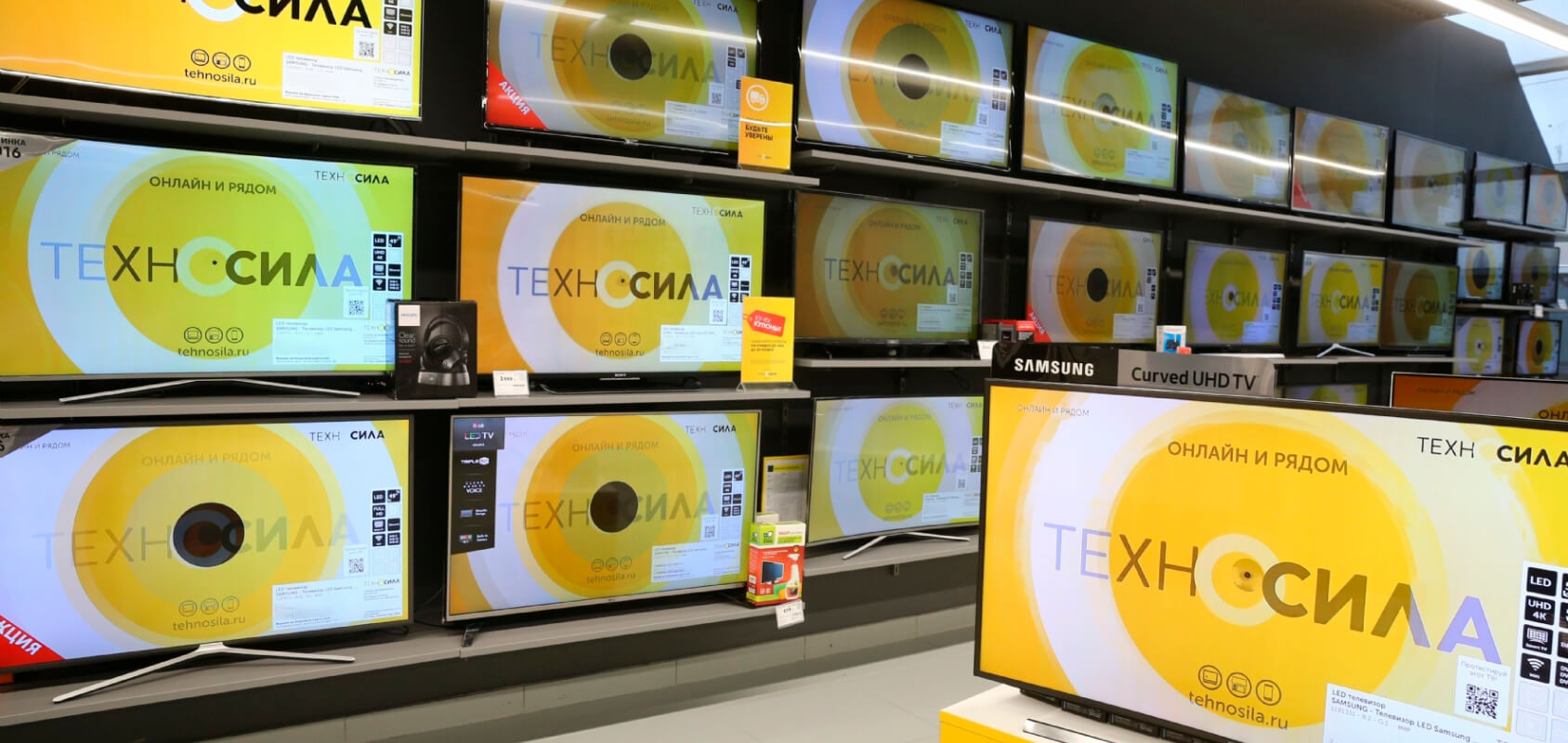
In order to convey these changes to the audience, the company has actually completely changed the visual language of the brand. For example, instead of the letter “o” in the word “Technosila”, a circle sign appeared in the logo. According to Ilya Timchenko, CEO of the company, this circle meant «a portal, a transition from an outdated state to a modern one.» That is, it symbolized the transformation of business.
Already six months after the rebranding, sales in stores of the new Tekhnosila format grew by 50% at once, and traffic on the site increased by 36% in the first eight months.
Delobank
In 2018, SKB Bank (now Sinara Bank) decided to create a new online bank for entrepreneurs. In a highly competitive environment, creating a new brand is not easy. After talking with entrepreneurs, it turned out that they do not treat their work as a business, this word is mainly associated with large enterprises. And they call it a «business», something more than an occupation. The name set the bank apart from competitors who talked about big business and money, or glorified entrepreneurs as demigods, but weren’t involved in the «cause.» Since the launch, 1,000 new customers have come to the bank every week. In nine months, brand recognition at the federal level has grown to 11%. Now Delobank is one of the market leaders, repeatedly recognized as the best bank for entrepreneurs.
The new bank set a high standard for the entire business, so the rebranding was carried out by the parent company, SKB Bank.
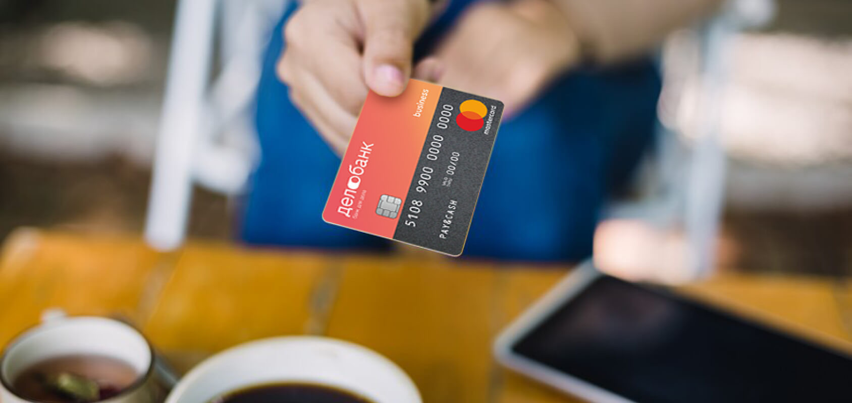
At a certain point in time, the development of the banking industry came to the point that the bank does not have to be universal and strive to serve all client groups. As a result, niche banks began to appear, both independent and as part of large banking groups. Perhaps the most striking solutions have emerged in the segment of servicing small and medium-sized businesses.
Delobank is a rare example in Russian reality of how marketing defines business. Ekaterinburg SKB Bank managed to create a unique product, visually and conceptually removed from the parent brand so much that many began to perceive it as an independent bank. This made it possible to make the maximum focus on the target audience and make the product available throughout the entire customer journey.
A naming that is understandable for the target audience based on a Russian-language solution, up-to-date branding that stands out for its simplicity and ease, an accessible mobile application and an online bank — all this is exactly what entrepreneurs expect from a bank. Largely due to this, the bank was able to occupy its niche and achieve decent financial performance, and its digital solutions have been repeatedly recognized as the best on the market according to the authoritative Markswebb.
Подборка статей о продвижении сайта в интернет. Обучение востребованным профессиям в сфере IT. Маркетинг. Анализ рынка. Полезные рекомендации проведения рекламных кампаний. Подпишитесь на нас в социальных сетях, что бы не пропустить важное.


Специальная подборка для Вас